energyhill Critiques the 2020 Presidential Candidate Logos
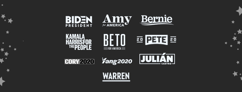
It’s that time of year again… Time for the presidential candidates (and their logos) to go head to head. The energyhill team discussed 10 democratic presidential candidate logos and gave them each a grade for their layout, color, and font.
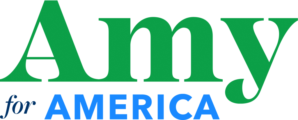
Amy Klobuchar
Klobuchar’s logo uses too many fonts and colors to be pleasing to the eye. The green is an unusual choice for a presidential candidate, and doesn’t evoke the patriotism that the other logos achieve. The serif font of the “Amy” looks nice and well-balanced, but clashes with the other two fonts, which individually are actually nice fonts. The designer mixed too many components together, without worrying about how everything flows.
Layout: C
Color: C
Fonts: C
Overall: C
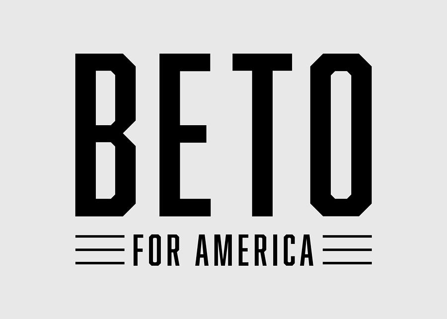
Beto O’Rourke
Beto’s logo is in black and white, which is untraditional. This combined with the font choice makes it look modern and minimalistic (Top Gun, anyone?). However, it doesn’t feel colorful or patriotic enough, and is too bold and condensed.
Layout: A
Color: C
Font: A
Overall: B+
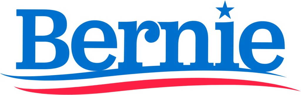
Bernie Sanders
Bernie’s logo is the same as his 2016 logo, without the year underneath the name. The blue and red lines create a nice sense of movement (although it is reminiscent of toothpaste). The star over the I is a nice touch, the kerning is perfect and the fonts are well done.
Layout: B+
Color: B+
Font: A
Overall: A-

Joe Biden
Biden’s logo is simple, bold, and beautiful. The D working into the E to turn it into a flag is a clever touch. The fonts and spacing are on point and there is good color choice and contrast. This logo pops among the others.
Layout: A
Color: A
Font: A
Overall: A

Pete Buttigieg
Buttigieg’s logo is unconventional, and not in a good way. It’s similar to a college football banner because the 20’s are split, so it just looks odd. The font doesn’t work, because the P and T aren’t slanted as much as both E. Overall, it does a poor job of getting across a patriotic message.
Layout: B-
Color: C+
Font: B-
Overall: C

Cory Booker
Cory Booker’s logo is arguably the least impressive of the bunch. Because of the rectangle around the text, the logo feels too tight and boxed in. The fonts and colors are similar to the Marvel logo, and the black and blue combination bleeds horribly. On a business card, this would be very difficult to read. His logo is similar to Tim Ryan’s, though Ryan’s is slightly better because they didn’t use black.
Layout: D
Color: C
Font: C
Overall: C-

Julián Castro
The colors are wonderful, but the JULIAN might be a little too bold compared to the weight of the border. The accent mark through the border is a nice touch and adds dimension to the layout. The “Castro” feels like it’s sort of jammed in, and the logo would have had better spacing and composition without it. This logo is still pretty great, and needs very minor edits.
Layout: A
Color: A
Font: B+
Overall: A
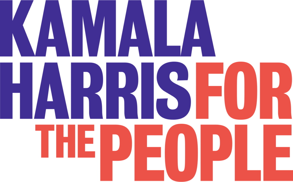
Kamala Harris
Purple and orange are a strange choice for a presidential candidate. There is no hierarchy in this design, since “for the people” is in a brighter color than “Kamala Harris,” but “Kamala Harris” is first. The stacked look doesn’t work, and is similar to the branding of Morgan and Morgan (a Tampa Bay local attorney’s office). There is some potential to work with the white space, but it serves no purpose in this design.
Layout: C
Color: C
Font: A
Overall: B-

Elizabeth Warren
Elizabeth Warren’s logo is simple, sharp, and straight to the point. The font is beautiful, but the color is up for debate. It looks great when it’s knocked out to white and laid over another color, but it can look sort of boring in the simple navy blue. The kerning is great, although the underline extends a bit too far out from the N. Overall, this design is fairly strong and would look great on a business card.
Layout: A-
Color: A-
Font: A
Overall: A
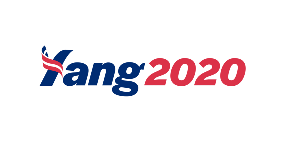
Andrew Yang
There are a lot of different things at play with Andrew Yang’s logo. First of all, the flag over the Y doesn’t really work because the letter can easily be confused for another letter like T or L. Scaled down, this logo would be very difficult to read. There is a sense of movement with the slanted text, but the type should have been uppercase to make the “Yang” stand out more than the 2020. They could have worked wonders with such a short name, but unfortunately this logo doesn’t quite hit the mark.
Layout: B-
Color: A
Font: A
Overall: A-
Sign up for our newsletter
"*" indicates required fields