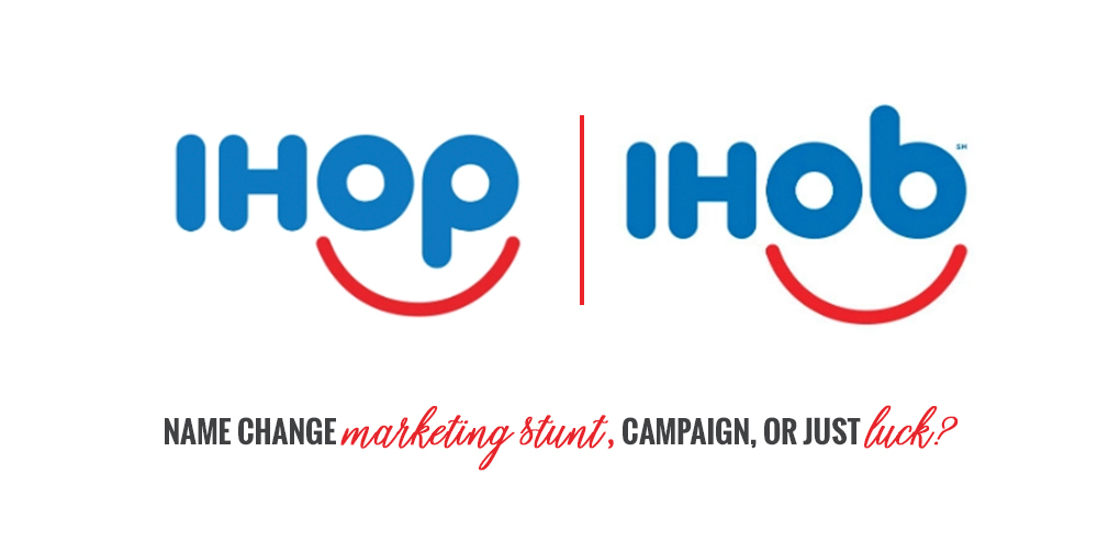
Remember that brief time in pancake history when IHOP changed its name to IHOb? Yes, it was a change that left the entire nation puzzled and somewhat feeling betrayed. However, this new identity was all too swift, as they went back to their old roots. And now, this change got us questioning, was this a brilliant IHOP marketing stunt or just luck?
IHOP received great exposure that put it on the spotlight. Otherwise, how else would they bring attention to their new menu addition - burgers? We can speculate that this IHOP campaign to put their burgers on the map worked. It got people lining outside their doors, including Food and Wine. Whatever the reason for this IHOP name change was, we sure are happy to see that the beloved International House of Pancakes would never turn their backs on pancakes - as they captioned on Instagram.
Getting these types of backlinks (e.g. Food & Wine) is ridiculously good for IHOP. When, if ever, would IHOP get this type of exposure? They wouldn't. This clever IHOP marketing stunt was a success that gave the chain restaurant online prominence.
With any major news comes major media coverage. And of course, this IHOP campaign was no exception. The media coverage for the IHOP name change illustrated their surprise as well as that of consumers. Fox News and NBC Right Now are some of the TV news stations that commented on this change. Sure enough people took this matter to Twitter where IHOP held a poll for users to guess the meaning of their new acronym.
We must admit that it was the best marketing stunt ever by a chain restaurant. Why? It's simple. Not only did this unexpected name change shake consumers to their core, it also brought plenty of press to the chain restaurant. The fine dining magazine Food & Wine, equally as surprised as the rest of us, featured the IHOP name change in an article about the restaurant's identity. This reflects the genius behind their marketing strategy because, again, when would IHOP get this type of exposure? It got people talking everywhere, on social media, on news channels, at work. Also, curious consumers and regulars now felt they had to go and try their burgers.
https://twitter.com/AntoniaMireles_/status/1012402427587416065
Listen to your Uncle Burger and burger a burger this 4th of July. pic.twitter.com/gdABIBd6kq
— IHOP (@IHOP) July 4, 2018
Do we still have burgers AND pancakes? pic.twitter.com/ANSsG6db66
— IHOP (@IHOP) June 28, 2018
Twitter is the platform of choice for people to take their opinions to. And surely consumers gave the world a piece of their mind, but did they take it too far? Did this new name call for a boycott?
YOU KNOW WHAT YOUR B IS FOR ME?
BOYCOTT.
— Jason Himself 🐘 (@JC0donuts) July 4, 2018
https://twitter.com/datonedumbnigga/status/1014467463428431872
We should also consider that luck played a role in the campaign. IHOP, a stamp for pancakes, has been around for decades. What better way to make national noise than to tease a brand change, while adding new menu items and increasing foot traffic to their restaurants? But how much more creative can one get to push a campaign for a menu item? Does that mean that other chain restaurants should pull the same strategy in exchange of exposure? We dare say no, this was just a one-time thing for IHOP and we do not think it will work for other restaurants. Think cry wolf. Our digital culture is quick to realize and adapt ... and even filter out future attempts. So, yes, maybe the stars aligned just right to bring the luck IHOP needed to pull this off. However, with smart campaigns, is luck even planned for?
Well done, IHOP! You kept us entertained, confused, and intrigued for a while, all to present your newest menu item and tease that you were changing your brand. At energyhill we were fascinated by this IHOP marketing stunt and think it was a smart move for the chain. As a marketing and advertising company, we understand strategies and always devise tactics to help businesses grow. Now, don't worry, we will not use the name change card, but we will use business strategies to push your business forward. Contact us to get more information and get the conversation started.
Engage with us on social and give us your thoughts on this brilliant campaign. It was a campaign right, IHOP?
Have you ever attended a training session or training seminar or listened to a sales pitch and got the feeling that you should leave or just end the meeting? Where you’re debating in your mind if it’s a waste of time? I think we all have been there before. We all know that time is money and money is time, there is always another project we could be working on and another email to respond to. In this post I’m going to give you a few cues that will help you decide when its time to leave.
I was recently invited to a training session for an online bidding system, I was already comfortable with the system they were going to discuss, however; Ryan and I decided to attend this event as a potential networking opportunity . So I packed up some business cards and brochures and headed to this seminar. I was unsure of what to expect. It was a government-hosted event so I didn’t expect anything spectacular, just thinking I could meet a few vendors who might be in need of advertising services themselves. I was wrong, and I left. Here is why.
Literally! I drove all over the USF campus trying to find this seminar. The location was not hyperlinked properly to get directions and when you searched the address. Google would say: “No results found.” A good thing to keep in mind if you are hosting an event, any event, is to always make sure those attending can find you.
Walking into an empty room is uninviting, it also makes you question if you are in the right spot (see above). If you are out to lunch, leave a note. If the seminar is in room 101, make a sign. Communication is key.
In a 3-hour training session, it’s extremely important to be engaging. Note cards are fine, but reading line by line from a training manual with little to no eye contact with those who are listening; is not only boring and impersonal. It also makes it that much easier for attendees to slip out the back.
Mindtools has some great tips on planning a successful training session
Remember these simple steps when planning your training session or seminar:
I don’t want to make this whole post negative, so let me tell you what I did take away from the 15 minutes I was there. I met a guy named Gary, he manufactures and sells prison uniforms. I learned there is a market for that, who knew? But honestly at the end of my 15 minutes I truly learned that it doesn’t matter what you do, people are going to leave your meeting with an experience. Whether it’s a few minutes into the meeting or in your closing statements after three hours. What is the experience you want your audience to leave with?
Check out our events page to find out when Energyhill is hosting a training workshop. We promise not to waste your time.