Rasmussen Periodontics

the ask

Dr. Rick Rasmussen is a highly successful and recognized dentist with an impressive background as one of the few board certified periodontists in the Tampa Bay area. Dr. Rasmussen wanted to distinguish himself from his family, all of whom are leaders in the dental industry, with a new website and brand. He needed a clean, sophisticated look that conveyed his expertise and care for patients.
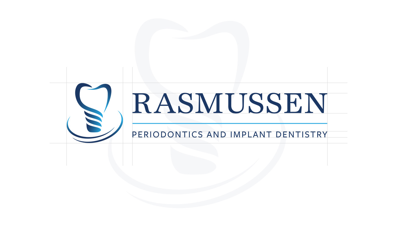
r3 logo

branding

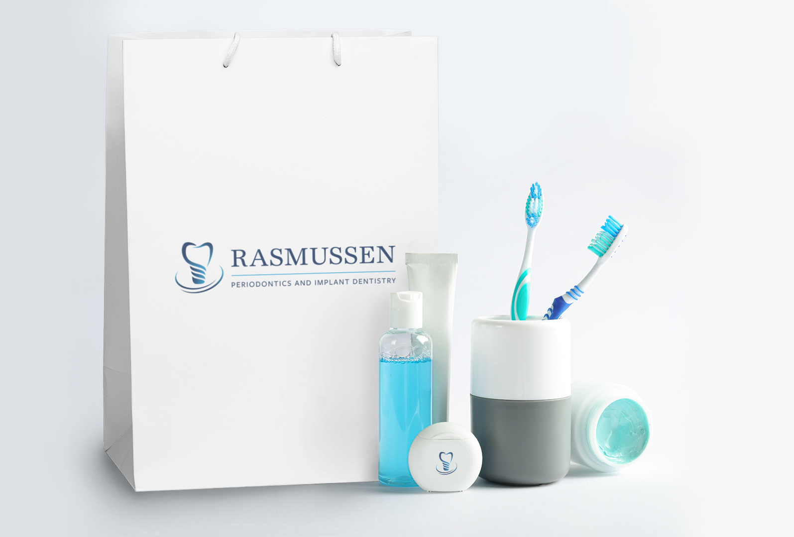
Combining different font weights along with a simple, fresh color palette gave the brand a clean and balanced look.

FONTS

  • Freight Sans Pro
  • Red Hat Text
Mint Green
#5bc4bf
r91 g196 b191
c60 m0 y30 k0
PANTONE 124-5 U
Navy Blue
#1b3760
r27 g55 b96
c100 m85 y35 k25
PANTONE 108-16 U
Sky Blue
#34a9de
r52 g169 b222
c70 m16 y0 k0
PANTONE 125-7 U
Flat Blue
#1062a1
r16 g98 b161
c94 m65 y7 k1
PANTONE 106-8 U
Fresh White
#ffffff
r250 g250 b250
c0 m0 y0 k0
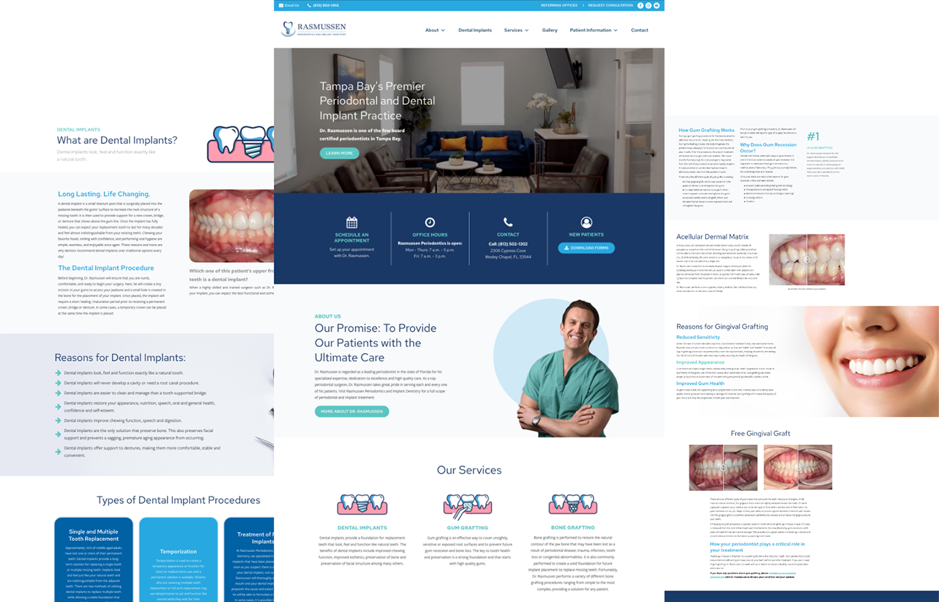
r3 web mockup

The process

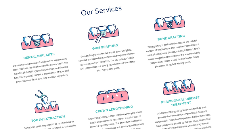
Our process in creating Dr. Rasmussen’s brand started with researching his audience and competitors. In this case, the audience was looking for information, but medical jargon can be difficult for patients to understand. So we paired the information with custom icons and visuals that would help explain difficult topics and keep potential customers informed and at ease. Using colors and gradients that provided a fresh look, we were able to keep the design simple and clean, while minimizing the clutter of information.
r3 screenshots
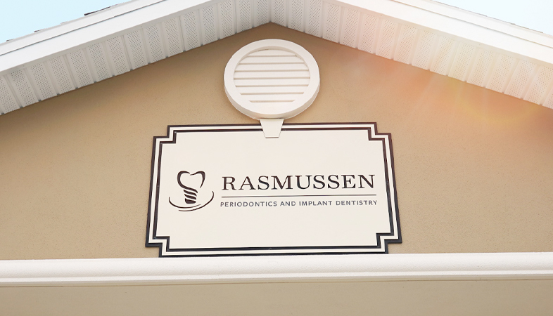
r3 building

Intentional web design

Our websites are designed with the target audience in mind, so it's important that users feel comfortable using the site and can easily locate what they're looking for. Keeping the colors bright and modern was essential to presenting Dr. Rasmussen as a trained professional. The iconography complimented the website design and showed some more complicated procedures that would otherwise be shown by messy graphic images.

intentional web design

Our websites are designed with the target audience in mind, so it's important that users feel comfortable using the site and can easily locate what they're looking for. Keeping the colors bright and modern was essential to presenting Dr. Rasmussen as a trained professional. The iconography complimented the website design and showed some more complicated procedures that would otherwise be shown by messy graphic images.
"energyhill is the best in the business. I am a surgeon and run my own private practice. They did an amazing job building and maintaining my custom website. Everything from design and strategy to communication and implementation was top notch. I highly recommend this business for any website or marketing project."
Dr. Rick Rasmussen

the end result

We created a strong brand narrative that would present Dr. Rasmussen not only as a leading professional, but as a caring individual that patients would feel comfortable with. Now he has a solid brand identity, a beautiful website, and a Google My Business account that is fundamental to the growth of his business.
U.S. Bridge Portfolio

Up Next:

U.S. Bridge
hello world!
linkedin facebook pinterest youtube rss twitter instagram facebook-blank rss-blank linkedin-blank pinterest youtube twitter instagram